How to make quick and easy charts with ggplot2
ggplot2 is a R data visualisation package.


Data visualisation is a very important aspect of the data analysis workflow. It is the point where a data analyst interact with the stakeholders and present their finding to them and Good Visuals helps the stakeholder to grasp your data in an easy and compelling way. One can say that visuals bring your data story to life and make it easier to understand
R has many packages to perform data visualisation and some of the most popular ones are ggplot2, Plotly, RGL, Lattice, Highcharter, Dygraphs, Leaflet, Patchwork, gganimate, and ggridges.
However, ggplot2 is the most widely used R package for a variety of reasons, including its ease of use, ease of coding, high-quality visuals, ability to customize plots, and many others.
ggplot2 was created by the statistician and developer Hadley Wickham in 2005 inspired by the book “The Grammar of Graphics” and thus the first two letters of the ggplots stand for Grammar of Graphics.
Before you start using the ggplot2, understand some basic and fundamental concepts: geoms, aesthetics, facets, labels and annotations.
Geoms are the geometric objects which represent the data e.g. In scatterplot points act as geoms
Aesthetics is the property of geometric objects present in the plot like the color, shape, and size of the data plotted.
Facets help in creating a smaller subset or smaller groups of your plot based on the variable present in the data.
Labels and Annotations as the name suggests it is used for labels and annotation in the plot
The basic minimal code to plot a visual using ggplot2 is
ggplot(data=<YOUR_DATA>)+
    <GEOM_FUN>(mapping=aes(<AESTHETIC_PROPERTY>))
In the above sample code replace with your actual dataset,<GEOM_FUN> with the geoms suitable for your plot e.g. geom_point for scatterplot, geom_bar for bar-chart, etc and with the suitable property for your plot like color\="yellow" etc.
uhh ... enough of words now let’s dive onto some programming :
To install ggplot2 you can install the collection of package tidyverse [ggplot2 is a core package in it] or only ggplot2.
Open your R console and start coding
# to install and load tidyverse
install.packages("tidyverse")library(tidyverse)
Or
# to install and load only ggplot2
install.packages("ggplot2")library(ggplot2)
For example, purpose take a popular dataset of palmerpenguins, to use this dataset run the following code
install.packages("palmerpenguins")
library(palmerpenguins)
data("penguins")
ggplot2 uses layer-by-layer formulation to plot the visuals like one layer combines the dataset, another layer map the aesthetics and so on. you will better understand with the following visuals.
Load the dataset to the ggplot() function
# set the dataset to be used
ggplot(data=penguins)
Output looks like blank page as it does not have any geoms added to it

Create a scatterplot to show the relation between flipper length and body mass of penguins
ggplot(data=penguins) + geom_point(mapping = aes(x=flipper_length_mm, y=body_mass_g))

Differentiate the data points in the plot based on different penguin species
ggplot(data=penguins)+geom_point(mapping = aes(x=flipper_length_mm, y=body_mass_g, color=species))

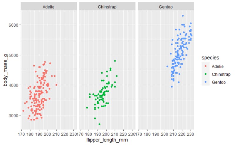
Create a separate plot for each penguin species
ggplot(data=penguins)+geom_point(mapping = aes(x=flipper_length_mm, y=body_mass_g, color=species))+facet_wrap(~species)
Create different (subset) scatterplots on the basis of species and gender of penguins to make better visuals
ggplot(data=penguins)+geom_point(mapping = aes(x=flipper_length_mm, y=body_mass_g, color=species))+facet_grid(sex~species)

But the Visual has some unclean data No worries ggplot2 can perform some data manipulation steps also.
For this example of palmer penguins, we require additional tidyr and purrr packages installed to clean the data. You can refer Tidyverse: A little universe for Analysts blog to understand the basics of data manipulation using tidyverse.
Create different (subset) scatterplots based on species and gender of penguins to make better visuals using clean data
ggplot(data=penguins %>% drop_na())+geom_point(mapping = aes(x=flipper_length_mm ,y=body_mass_g, color=species)) +facet_grid(sex~species)

Add title and subtitle to plot to make it more clear and compelling
ggplot(data=penguins %>% drop_na())+geom_point(mapping = aes(x=flipper_length_mm, y=body_mass_g, color=species)) +facet_grid(sex~species)+labs(title ="palmer penguins",subtitle = " Body Mass vs Flipper Length" )

Incline the X-axis value of the plot to some angle so that reader can easily get the values
ggplot(data=penguins %>% drop_na())+geom_point(mapping = aes(x=flipper_length_mm, y=body_mass_g, color=species)) +facet_grid(sex~species)+labs(title ="palmer penguins",subtitle = " Body Mass vs Flipper Length" )+theme(axis.text.x = element_text(angle=30))

You now know how to use ggplot2 to visualize your data using a scatterplot, explore the various plot types available in the ggplot2 package, and advance your journey into data visualisation. Don't forget to explore the numerous additional data visualisation packages available in R.
If you enjoyed the content consider subscribing to my blog and share what do you use for data visualisation in the comments.
Resources:
- Download your ggplot2 cheatsheet - here